An Introduction to Diagonal Lines in Photography
This is my third post on the use of lines as a composition technique. In this post we’re going to look at the effect that adding diagonal lines has on a photo. Diagonal lines are important factors to add to your photos now and then. You can use them to create tension and dynamics and lead the eyes in a particular direction. Adding lines to a photo is like hanging photos on a wall. They’ve got to either be perfectly or deliberately poorly aligned. If your lines are almost aligned with one other, it looks like a mistake that needs straightening. Diagonal lines aren’t compared to the frame of the photo in the same way that horizontal and vertical lines are. They have the freedom to move around and do what you want them to do. This, in many ways, makes them much more useful.
Three Types of Diagonal
There are three different types of diagonal lines in photography:
actual diagonal lines objects placed diagonally in a scene a diagonal line created by the viewpoint
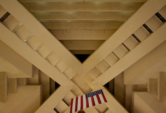
The latter is the one you’ll be most familiar with, so much so that you don’t even see it any more. It’s easy to spot diagonal lines just looking around. The difficult part is using them creatively to add to your composition. Here’s a photo of the strip in Vegas. It would have been relatively straight shot face on. Because I decided to shoot from the side, it became diagonal. Next is a photo of the diagonal lines used in a building. There’s no way to take a photo of this roof without having diagonal lines in a photo. And below is a set of diagonal lines that were created by the viewpoint of the camera.
Leading the Eye
Diagonal lines can be used by photographers to lead the eye to a point in the image. Diagonal lines are extremely effective at doing this. Tension is created by intersecting a diagonal line, which makes the eye focus towards this point. Have a look at this photo below of a model sitting on rocks on a beach. You’ll see that the diagonal line in the background draws your attention up the photo, towards the head. This is especially useful if you’re trying to draw the viewer’s attention to a particular feature. A similar technique is also implemented in the photo below.
Depth
Diagonal lines created by a viewpoint have a diminishing effect and create a sense of depth. This can be increased or decreased by the amount of the diagonal line you choose to include. Had I taken the photo above from farther away, the image would appear deeper. I chose that particular viewpoint because I wanted the rocks available in the foreground to create another, less obvious diagonal line. Another great way to add depth with a diagonal line is to include a path in your photo, as shown in the photo below. This small, easy technique has made my photo a lot more interesting.
Vertical Into Diagonal
A typical issue with viewpoint is that it changes the way we see a vertical or horizontal line. The slightest change in viewing angle can make a vertical look diagonal, shown in the photo below. This isn’t necessarily a bad thing. If you want to avoid this effect altogether, take the photo from farther away using a telephoto lens. The compression from using a longer focal length will make those lines appear vertical or horizontal again.
Tension
Diagonal lines don’t appear as often on manmade objects as we tend not to use them in construction. As a result, using them in photography helps add contrast and dynamic tension to a photo where you wouldn’t ordinarily see it. The more diagonals involved, the greater the effect. Have a look at the photo below. It looks ordinary at first glance. If you stare at it a while longer, you’ll notice the tension built up by the multitude of diagonal lines converging at an approximate point. The more lines, the greater the tension – remember that.
Multiple Diagonals
More than one diagonal line in a photo helps to build a sense of tension, as you’ll see from the photo below. Here, diagonal lines at roughly the same angle builds a sense of direction. More subtle diagonals, like the movement of the stars in the sky, help to reinforce this direction. All of this amounts to your eye focusing on a particular point of the photo. This is usually where the diagonal lines end, on the right hand side.
Unstable
Because we’re not used to seeing diagonals in buildings, we don’t consider them to be particularly stable. If you want your photo to look unstable, add diagonals. It’s a great way to make it appear less stable. Adding multiple diagonals is even better. Have a look at my photo below. From the shape of the rocks, the direction of the breakwater and my model’s positioning, you’ll start to see countless diagonal lines. Because of the nature of the location and the model’s precarious positioning, you’ll see that the whole photo looks unstable.


